
In a time when overconsumption and environmental challenges are at the forefront, we saw an opportunity to make a difference. There’s already enough clothing in circulation the goal is to extend the life of garments by making it easy to rewear, repurpose, and redistribute fashion.
Our primary objective is to reduce the carbon footprint of the fashion industry while offering affordable and accessible clothing options to everyone.
3 months
I was responsible for conducting user research, creating user flows and wireframes, and designing the overall UI/UX of the app.
People who care about sustainability, enjoy vintage fashion,
and often have a limited budget struggle to find affordable, unique clothing.
Many individuals who want to declutter their
wardrobes don’t have the time, tools, or motivation to sell or trade their pre-loved clothes.
Additionally, for people whose style changes frequently, their closets quickly fill with items they no longer wear creating a need for an easy and efficient way to resell or exchange clothing.
To better understand user needs, I conducted interviews with a diverse group of people interested in sustainability and second-hand fashion. These conversations helped me uncover not only key user motivations and pain points, but also direct and indirect competitors in the market.
The interviews played a crucial role in shaping realistic and focused user personas, by revealing people’s attitudes toward sustainable fashion, their shopping habits, and the barriers they face when trying to sell or trade clothing.

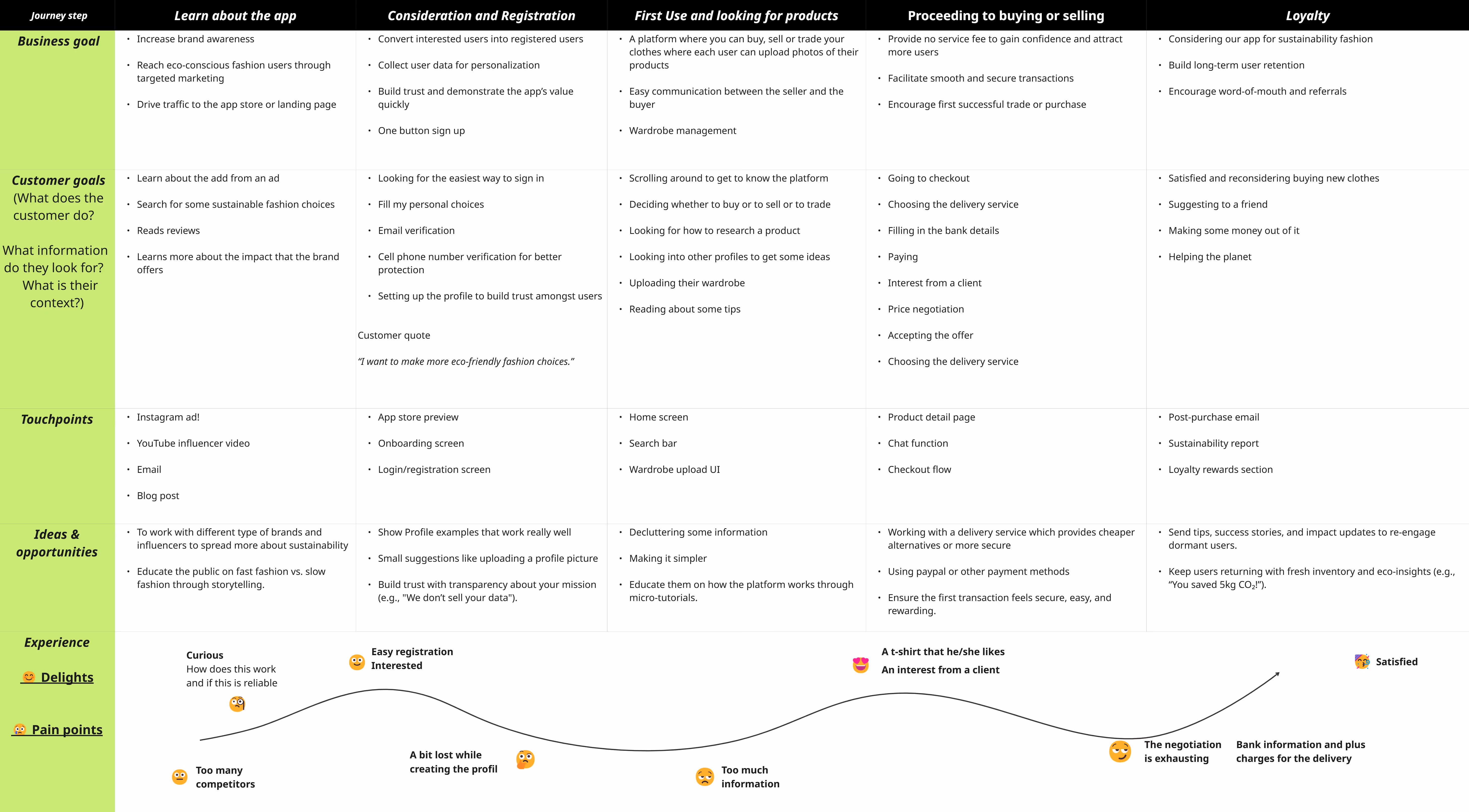
To better understand the user's experience and pain points, I created a detailed journey map based on a typical user scenario: someone wanting to declutter their wardrobe and use Re:Wear to trade or sell clothes.
The map outlines each step of the user’s interaction—from discovering the app to completing a transaction. It helped highlight emotional highs and lows, friction points, and opportunities to improve the flow. For example, I noticed that users often feel overwhelmed when negotiating, so I simplified proposed the trading option or already built new price proposels.
To better understand my users and define key design opportunities, I created a "How Might We" (HMW) map based on user needs, frustrations, and behaviors. I identified three main user types:
- People who care about sustainability and enjoy vintage fashion but often have limited budgets
- People who want to sell their old clothes but feel overwhelmed by clutter and don’t have the time to list items
- People who frequently change their style and want to quickly clear out their closets

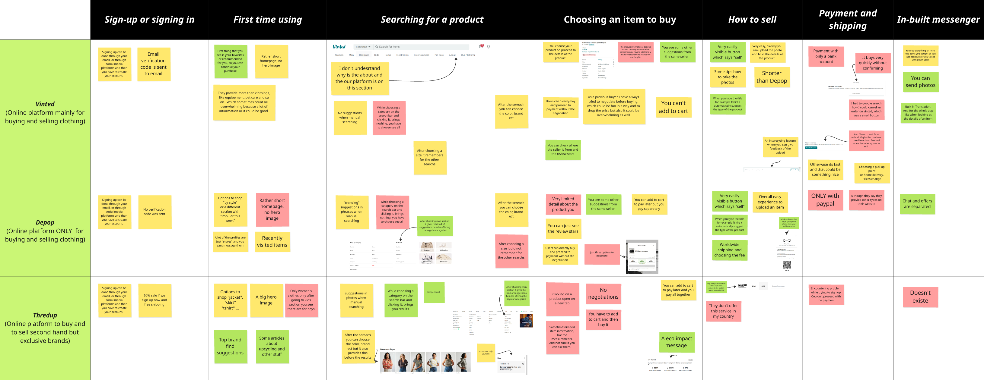
One of the most important steps in the UX process is benchmarking. I conducted a thorough analysis of competitor apps to evaluate their features, user flows, and overall experience.
My top three references were Vinted, Depop, and ThredUp. This research helped me identify essential features to include, as well as opportunities for improvement. For example, Re:Wear introduces a unique Trade feature that doesn't exist on any of these platforms, setting it apart from the competition.
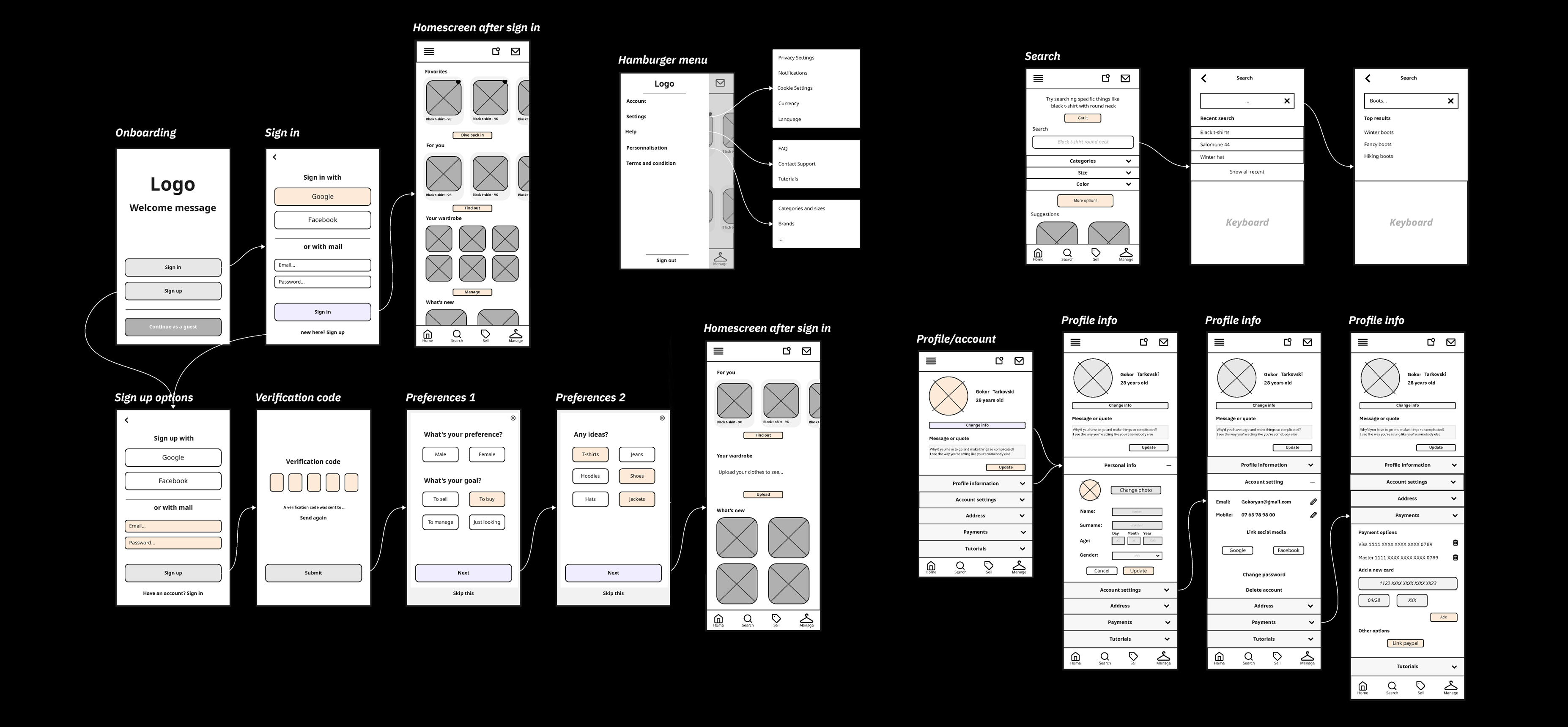
Before moving into detailed design, I created a user flow to understand how people would naturally navigate through Rewear. The goal was to make the experience simple, intuitive, and motivating, encouraging users to both give a second life to their clothes and discover new pre-loved pieces easily.
I started by identifying the key user actions: signing in, browsing items, selling, exchanging or trading and payment and delivery. Mapping these steps visually helped me define how each screen connects to the next, ensuring there were no dead ends or confusing transitions.

To better understand the value Re:Wear could bring to its users and the planet, I created an impact map early in the design process. This tool helped me connect the app’s goals with user behaviors, potential features, and the meaningful outcomes they could generate.
To better understand the needs, motivations, and habits of second-hand clothing users, I conducted a series of interviews with people who regularly buy or sell pre-loved items. These conversations helped me identify both the strengths of existing platforms and the gaps that Rewear could address.
A recurring insight from participants was that “there is already Vinted”, which highlighted the importance of designing a platform that doesn’t simply replicate what exists. Instead, the research pushed me toward creating features that feel unique, purposeful, and genuinely useful—especially when it comes to sustainability. One idea that emerged very clearly was the trade feature. Several users expressed interest in swapping clothes instead of buying or selling, describing it as more economical, fun, and environmentally responsible. This validated the idea of centering Re:Wear around a circular, exchange-based experience rather than a purely commercial one.
The interviews also revealed key pain points with current second-hand apps: slow communication, long shipping processes, a massive quantity of listings that can feel overwhelming, and a general lack of trust between users. Many participants also said they wanted a platform that felt simpler, calmer, and more local, with an easier way to browse and upload items.From these insights, several opportunities emerged:Create a smoother, three-step listing processEncourage local and eco-friendly exchangesImprove clarity through minimal, accessible UISupport sustainability with optional impact informationBuild a community-driven environment rather than a marketplace feelOverall, the research phase helped shape Rewear into a platform that focuses on simplicity, trust, sustainability, and meaningful interactions. It ensured that every design decision was grounded in real user needs rather than assumptions.
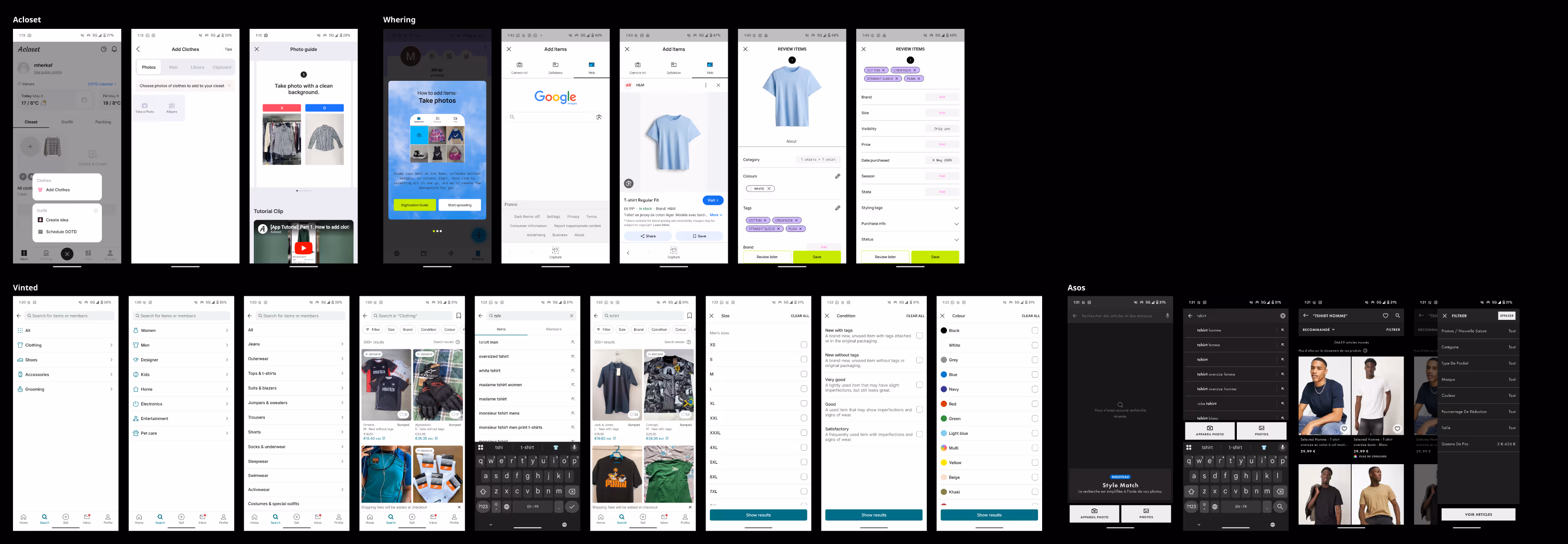
Wireframes are a crucial part of the UX and UI design process. At this stage, I explored both hand-drawn and digital wireframes to visualize the core structure.
This step was essential for defining the app’s user flow, hierarchy, and accessibility before moving into high-fidelity design. Working on both paper and screen helped me quickly test ideas and adjust layouts with flexibility.
Since Re:Wear was developed as part of an online UX/UI course, sharing and discussing the wireframes with other learners became a great opportunity for feedback and collaboration. These exchanges helped me refine navigation, improve usability, and ensure the interface felt inclusive and intuitive for all users.
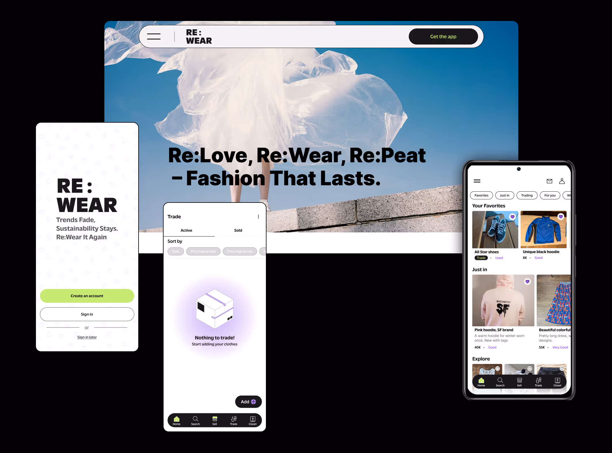
After refining the structure through wireframes and user flows, I moved on to the high-fidelity UI design for Rewear. At this stage, my goal was to translate the app’s sustainable mission into a clean, modern, and intuitive visual identity that supports effortless circular fashion.I focused on creating an interface that feels minimal, bold, and easy to navigate. The color palette is centered around a contemporary combination of green, purple, white, and black, giving the app a fresh and futuristic feel. Green is used to highlight key actions, purple adds personality and contrast, white maintains clarity inside the layout, and black provides structure and depth. Typography is simple and highly legible, reinforcing hierarchy and clarity across browsing, filtering, and uploading screens.
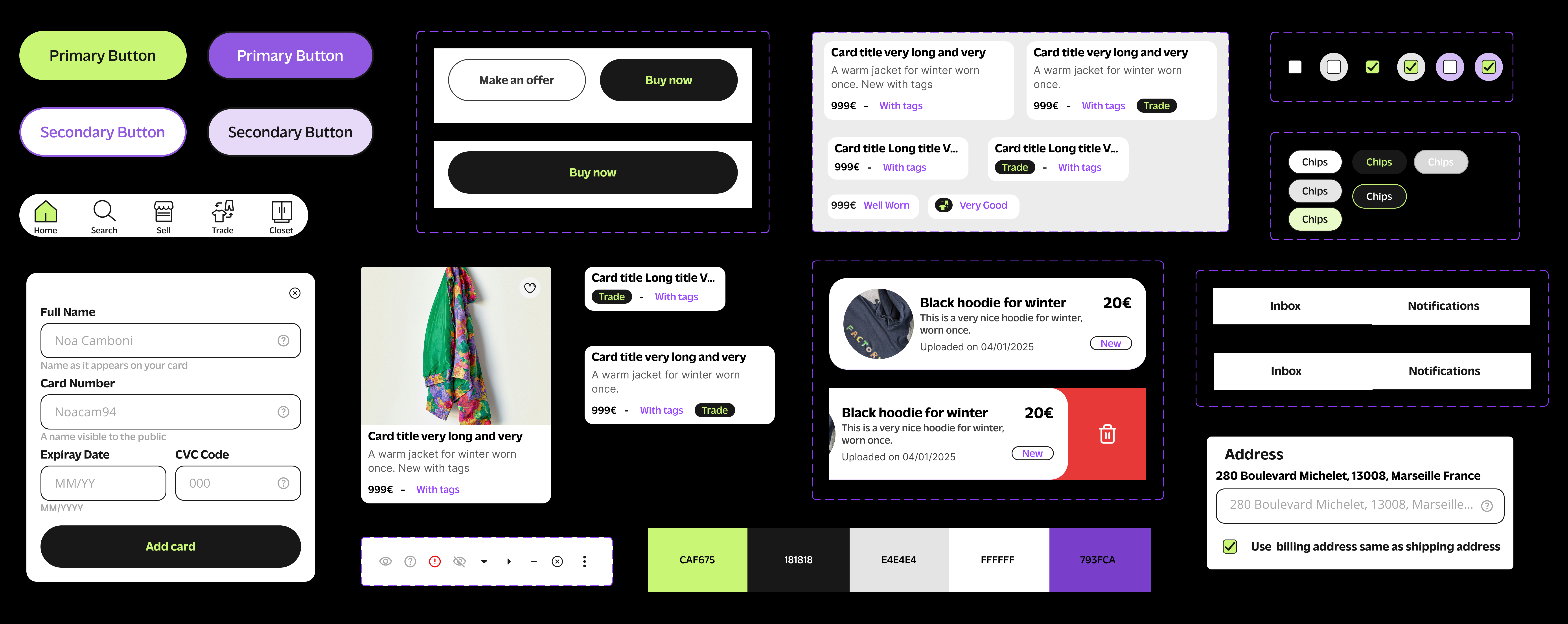

The empty states use soft, friendly illustrations that match the visual spirit of the app. These playful visuals reinforce the idea that the experience is accessible, warm, and easy to navigate even when there’s nothing to show yet. Whether the user’s closet is empty, their inventory has no listings, or they haven’t made a sale yet, each empty state provides a gentle and welcoming message.
The illustrations help maintain engagement and guide users toward their next action without feeling discouraging. By pairing minimal layout with charming artwork, the empty states contribute to an overall atmosphere that is user‑friendly, encouraging, and consistent across the app.
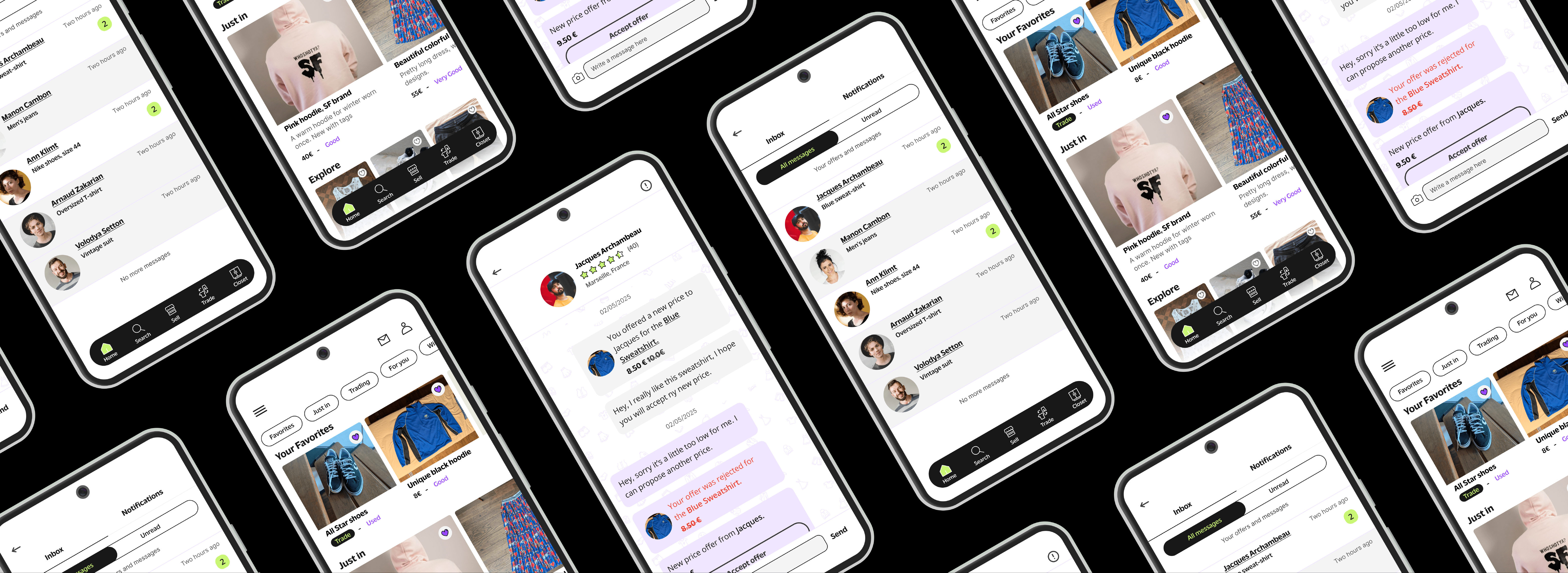
A major challenge was balancing aesthetics with usability. Because many users find second-hand platforms visually dense or chaotic, I intentionally curated a layout that is light, spacious, and structured. Product cards, buttons, and navigation components were designed within a consistent system of spacing, icons, and micro-interactions to ensure visual harmony across the app.The validated trade feature also shaped the UI. I designed a dedicated trade flow that feels quick and friendly, guiding users through proposing or accepting a swap with clear steps. Subtle animations and smooth transitions help make the experience feel more dynamic and personal.
The landing page serves as a simple, informative extension of the app, created as part of the UX/UI course project. Its purpose is to introduce the concept, communicate the team’s vision, and provide a clear overview of the project’s values.
For the website, I created a simple set of wireframes to establish the core layout and structure before moving into visual design. The goal was to keep everything clear and intuitive, focusing on how users would navigate sections like About Us, Our Team, Our Views, Work With Us, and Tutorials.These wireframes helped define the hierarchy and flow of the landing page, ensuring that each section feels easy to access and consistent with the app’s overall user-friendly approach.

Overall, the landing page is clean, minimal, and aligned with the visual identity of the app—serving as an accessible gateway for users, collaborators, and anyone interested in the project.
The website includes sections such as About Us, Our Team, and Our Views, allowing visitors to understand the mission behind the app and the design decisions that shaped it. There is also a Work With Us section to invite collaboration, as well as a Tutorials section offering guidance on how to use key features of the platform.